
How to make individual interface elements more catchy


If you wish an object to catch the eye and be easier to remember, make it to be slightly different from the rest to stand out from the set of other similar objects. This will increase the chances that it will not go unnoticed by your users and that they will remember it. This is due to the isolation effect discovered and described by German psychiatrist Hedwig von Restorff in her studies of the isolation paradigm. Also known as the Von Restorff effect, it explains the distinctive features of an object that isolate it from other objects. These features make users perceive the object differently or, rather, attract more attention to it. These may include size, shape, color, spacing, etc. (A common example in texts is using bold, italics, and underscore.)
Imagine a basket full of green apples with just one red apple in it. You’ll definitely notice the red apple, which will get into your memory. On the other hand, you will unlikely remember each of the green apples individually. See how a short piece of text in bold attracts your attention.

How can be the Von Restorff Effect applied to your product? Take branding colors, for example. It’s not uncommon for many to think that the only way to introduce a branding color in a product is to use it as much as possible, like aimlessly filling the background of a web page with a single color. Instead, thoughtful and moderate use of the color across your product interface can bring more benefits. For instance, if you want users to associate blue color with your product, you can add some blue to the important action buttons to make them easily distinguishable against the rest of the page that can be built in a monochrome scheme with shades of grey. This will introduce and promote the branding color without visually overloading the entire page.
When you implement the isolation effect in your interface, you can navigate users’ attention, ultimately triggering their emotions. This can have great benefit in improving user experience, simply by highlighting certain information or required user actions.
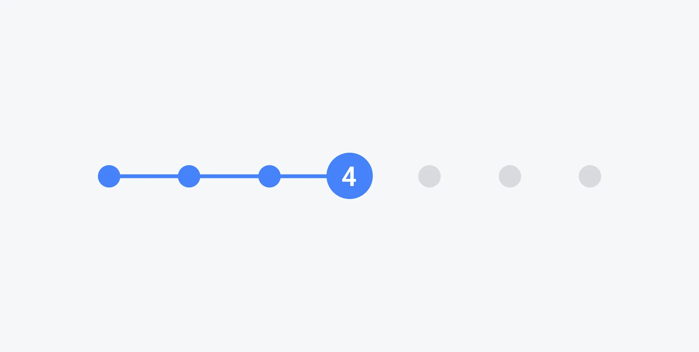
For example, you need users to fill out a form that is too long and can potentially repel them. You can throw in markers by changing the color or shape of the current step, making it easier for the users to track progress. This will result in more focus on the current step and provide less user attention to the rest of the steps. Using a brighter color on the completed steps can distract the user’s attention from the number of the remaining steps. The message the user is getting is this: ‘I’ve completed three steps already ’ instead of ‘I yet have to complete six more steps’.
More attention to one is less attention to the rest
Being limited at any given moment, attention is a precious resource that has to be managed thoughtfully. This is why you’ll want to avoid having too many distinctive elements as they can quickly drain human attention. As opposed to that, when most of your attention is drawn to a distinct element, the rest of the elements will stand back.

In a pricing table, highlighting one plan with different sizes/shapes/colors will draw users’ attention to it. They will take the suggested path and focus on the anchor point in the table. Thus, the user will be motivated to choose a particular plan, i.e. Standard plan, instead of Corporate or Lite plans. If, instead, you want users to make their own choice without any hint from you, make the pricing table elements the same.

If one object seems more important, other objects will fade into the background. Therefore, keeping balance is vital in order to preserve consistency in your interface.
Choose mindfully
If you like to draw users’ attention to certain elements, make these elements stand out: highlight an important part of the text, color-mark big dates in a calendar, etc. For a better user experience, make shifts in colors, styles, sizes, shapes, and other tools to navigate users across important elements in your interface.
Don’t overdo!
The excessive amount of various shapes and sizes can potentially grow into heavily distracting visual noise. Not only will this make users lose focus on what’s really important, but also place too much cognitive load on the user draining their energy.
⚠️ Keeping the balance is key to creating clean interfaces with properly weighted accents on important elements.

